A New Perspective
| Welcome to 2020, a brand new year. A perfect moment to introduce a new look for Cashmere in Love.
Staying true to our nomadic travelling tendencies, we’ve been on a journey of a different kind over the past 12 months – setting out to evolve, expand and add depth to our beloved brand with an upbeat energy and expression of exquisite retro-modern design. |
 |
 |
|
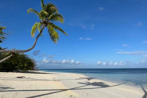
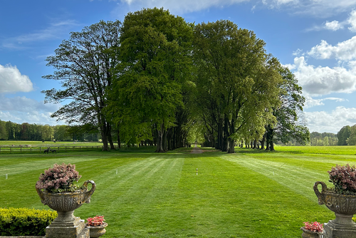
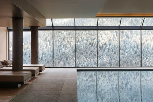
Our new visual style takes cues from well-travelled sources of inspiration, including the artistic Mediterranean and the oh-so-chic slops of the Dolomites and French Alps.These bountiful places have inspired a rich, new colour palette of juicy, vibrant reds and earthy, sophisticated tones, which you might see play with complementary colours such as Klein Blue from time-to-time, and stay fresh with supporting hints of snowy ice-white. |
|
|
 |
|
Our new shortened CiL logo has a bunch of character, influenced by a melting pot of European classic brands including Cinzano, La Poste, Il San Pietro di Positano and vintage travel posters, along with geometric artworks by artists of the Bauhaus. And it doesn't stop there, oh no! |
|
|
|
Named after the Greek founder of geometry Euclid, known as 'The Glorious', even our brand font inherits the spirit of the Med; perfectly complimenting the geometric shapes of our logo and graphics. |
|
|
 |
|
You'll start to see our new identity come to life online and in emails throughout the year (make sure to sign up to our newsletter below) and, if you look closely enough, you might find some little tucked-away details and surprise messages nestled into our packaging. Because we believe that little moments of unexpected joy make for a more positive and delightful world. |
|
|
| So here’s to a lovely year ahead, in cozy cashmere of course. Winter sun, Spring sun, Summer sun, here we come! |
 |